import seaborn as sns
import matplotlib.pyplot as plt
import pandas as pd
# Sample data
data = {
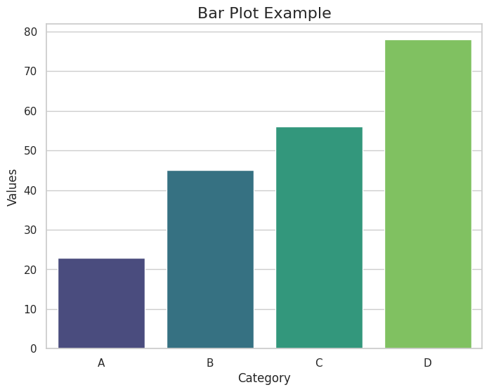
'Category': ['A', 'B', 'C', 'D'],
'Values': [23, 45, 56, 78]
}
df = pd.DataFrame(data)
# Create a barplot
sns.set(style="whitegrid") # Optional: Set a clean grid style
plt.figure(figsize=(8, 6)) # Set the figure size
sns.barplot(data=df, x='Category', y='Values', palette='viridis')
# Customize the plot
plt.title("Bar Plot Example", fontsize=16)
plt.xlabel("Category", fontsize=12)
plt.ylabel("Values", fontsize=12)
# Show the plot
plt.show()